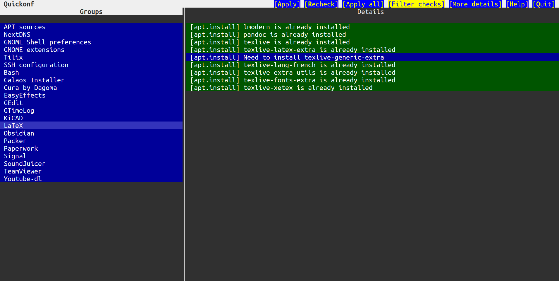
User interface
The interactive user interface is composed of two panes.
The left pane lists all groups (according to your configuration file), while the right pane shows details on the selected group.
Filters and details
By default, groups are filtered so that only groups in need of a change are displayed. You can toggle this filter with the “F” key or the “Filter checks” button in the title bar.
If you need more details about actions that would be executed, you can toggle them with the “D” key or the “More details” button in the title bar.
Colors
Checks
- grey: waiting to be checked or being checked
- green: everything is already applied
- red: a check failed, giving up
- blue: there is something to change
- yellow: currently applying
Details
- green: nothing needs to be applied
- blue: something must be applied
- yellow: currently applying
- red: applying change failed (next instructions are aborted)
Keyboard usage
| key | action |
|---|---|
| left | switch to the checks pane |
| right | switch to the details pane |
| up (checks) | select the previous group |
| down (checks) | select the next group |
| up (details) | scroll details up |
| down (details) | scroll details down |
| enter, a, A | apply the selected group |
| r, R | recheck the selected group |
| l, L | apply all groups |
| f, F | filter the groups (hide/show the succeeded groups) |
| d, D | show more details |
| h, H, ? | display the help |
| q, Q, esc, ctrl-c | quit Quickonf |
The page up, page down, home and end keys may also be used to navigate in checks and details.
Mouse usage
The buttons in the top-right corner are the following:
| button | action |
|---|---|
| Apply | apply the selected group |
| Recheck | recheck the selected group |
| Filter checks | filter the groups (hide/show the succeeded groups) |
| More details | show more details about changes in the right pane |
| Help | show or hide the help section |
| Quit | quit Quickonf |
You can click on a group to select it, and you can use the mouse wheel to navigate in checks and details.